The Fine Artist’s Color Palette
I’ve always found myself drawn to the colors and textures used by fine artists. The first time I stood in front of a painting by Van Gogh in a museum, I realized that I could spend a lifetime learning from his passionate obsession with color.
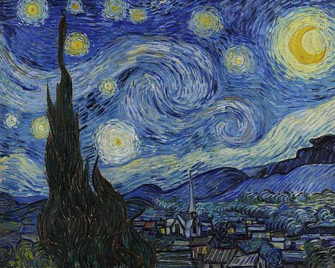
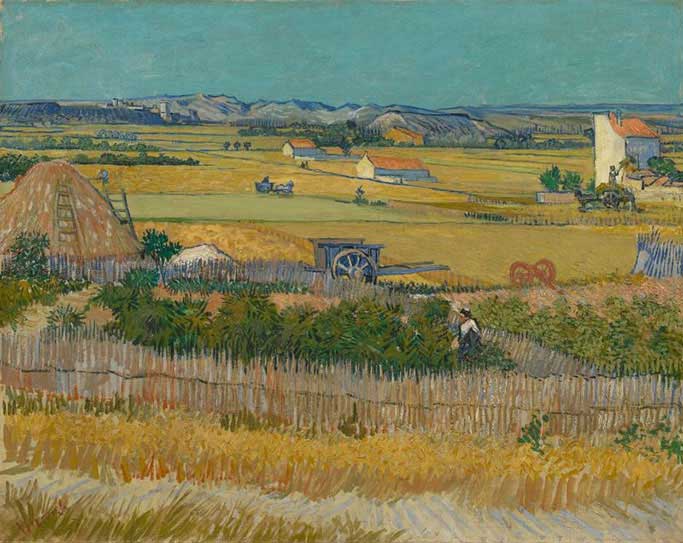
There is a beautiful balance between each color from sapphire blue to Indian yellow that lights up the canvas and creates a sense of intensity and depth. This play between blue and gold is one that is repeated in different incarnations throughout Van Gogh’s oeuvre.
“There is no blue without yellow and without orange.” – Van Gogh
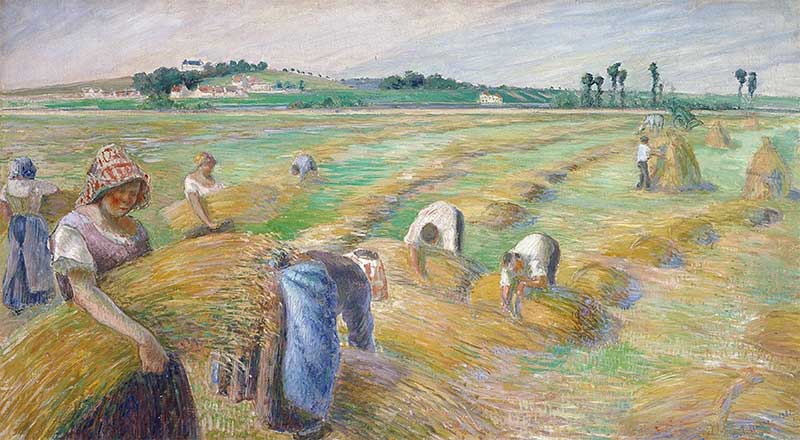
Van Gogh is usually considered to be a Post-Impressionist painter and the forefather of Expressionism. In contrast to Impressionists such as Renoir, Pissaro, and Monet, Van Gogh pushed his color palette to almost surreal levels. Yet, he maintained the classic Impressionist subject matter of pastoral scenes and portraits. Deep blues, oranges and yellows were thickly applied to the fine artist’s canvas
The intensity of these colors create their own vibration, enhancing the emotion of the artwork
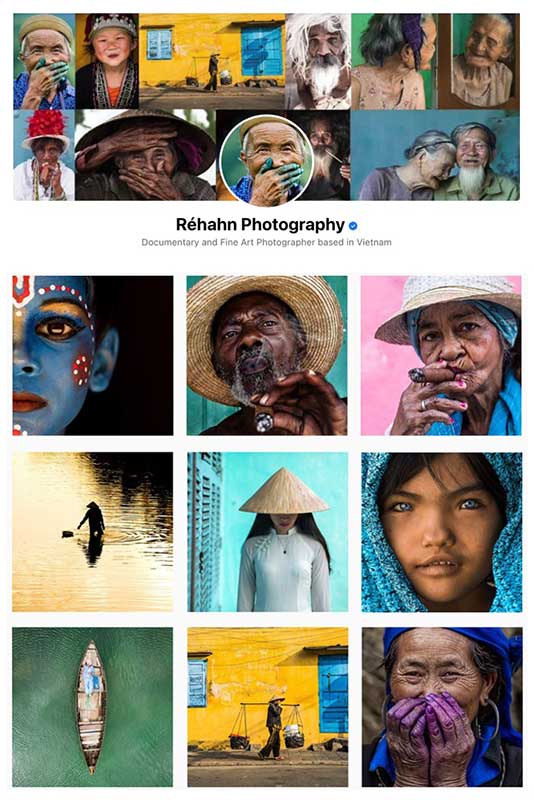
My portrait period for The Precious Heritage Project had a much different style than my current Lifestyle photographs. For Lifestyle, I’m inspired by the softness and pastoral scenes of the Impressionists and the emotional response I get when I look at the colors used by certain artists. Such as the brilliant yellows and blues so often used in Post-Impressionist Fine Art
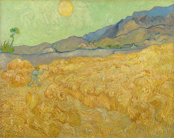
Luckily, these colors appear as if by magic in Hoi An, Vietnam. As I walk my daughter to school, I am surrounded by golden ricefields and bright blue skies. I often feel as if I’m walking right through Van Gogh’s “Wheat Fields.” Perhaps, this is part of why I instantly felt at home in my adopted country.
Regardless of whether I’m shooting a portrait or a scenic photograph, I always prefer a background with no distractions. I know that my style is inspired by my surroundings. If I lived in a large city I would certainly have a different way of preparing my photos. In Vietnam’s countryside there’s nothing to change. Yellow appears in nature as bright as if it came from a tube of Cadmium yellow fine art paint. The scenes are already here. I just have to decide how I want to frame them.
My Yellow Period
What brought on Van Gogh’s yellow period is debatable. Some experts believe it was the sunnier climate of Southern France and the scenic beauty of the area, others think it was created by a medication that the painter took that literally caused him to see the world in yellow. Regardless, of why he chose this tone, the paintings that resulted from this period were an undeniable success.
“How wonderful yellow is. It stands for the sun.” – Vincent Van Gogh
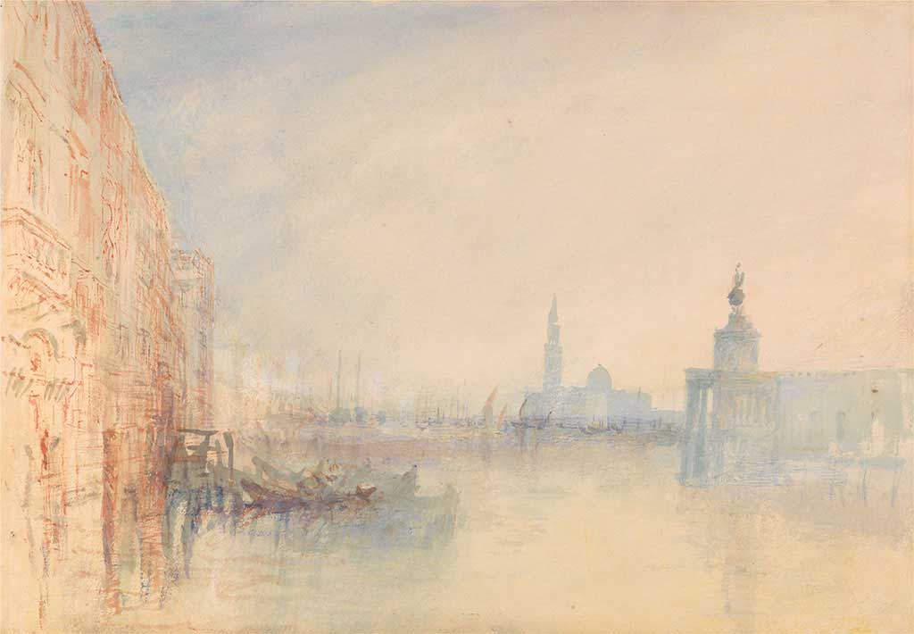
Another 19th-century painter who used the yellow spectrum to great effect in his Fine Art was Joseph Mallord William Turner. Turner was an English Romantic painter but many of his paintings hover near Impressionism.
I have a book of Turner’s paintings of Venice that I often turn to for inspiration. He was known for paintings flooded with yellow tones to create the sense of sunlight imbued with movement. There is even a yellow paint named after him called Turner’s Yellow.
As I look through my Lifestyle photographs from the last decade, I notice that I can also trace my “yellow period” in my fine art back to a certain place and time. Dozens of my photos started to be filled with lemon and cadmium, ochre, and goldenrod yellows since I started living in sunny Hoi An.
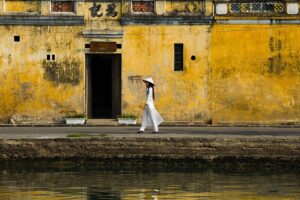
The Yellow City of Hoi An
I think of Hoi An as my open-air studio. From the way that the sun catches the waterways to the layers of peeling golden paint on the walls, the town is always changing with the light.
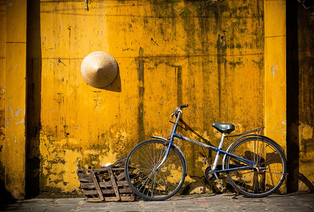
I have many photographs using the same simple yellow textured background that I took over the course of nearly a decade.
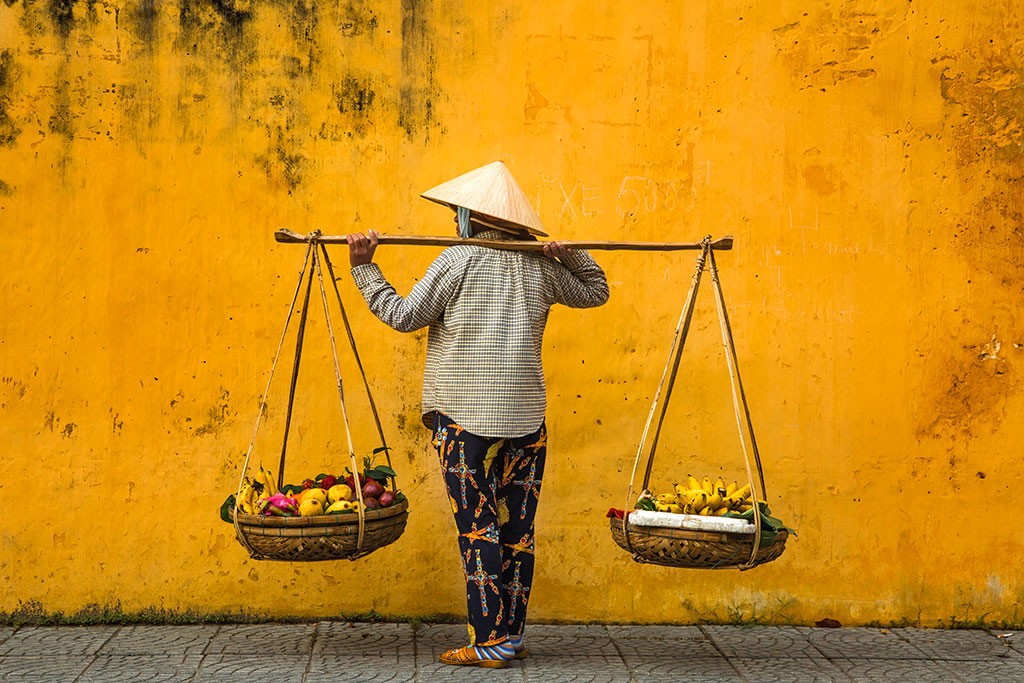
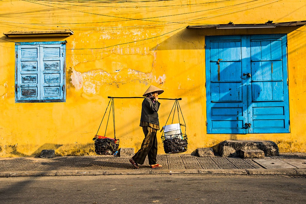
One of my favorite photo techniques is called “fishing photography.” I simply find a background that I like, such as the rust and ochre wall above or the marigold wall accented by blue windows below, and I wait for a subject that interests me to walk past.
Read more about fishing photography in the “The Yellow City of Hoi An
Vietnam’s Harvest Season
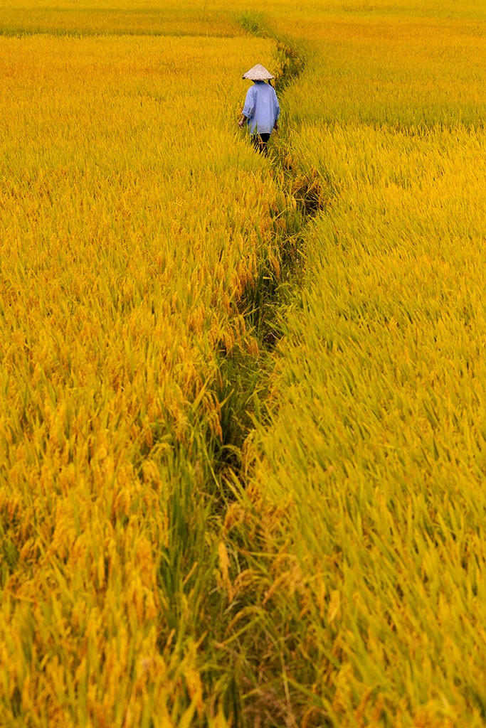
My more recent work focusing on scenes of rural life in Vietnam has aligned with the country’s harvest season when the land seems to come alight with golden fields. Like Van Gogh, Turner and Pissaro, I’m invigorated by pastoral scenes and the natural beauty of the world.
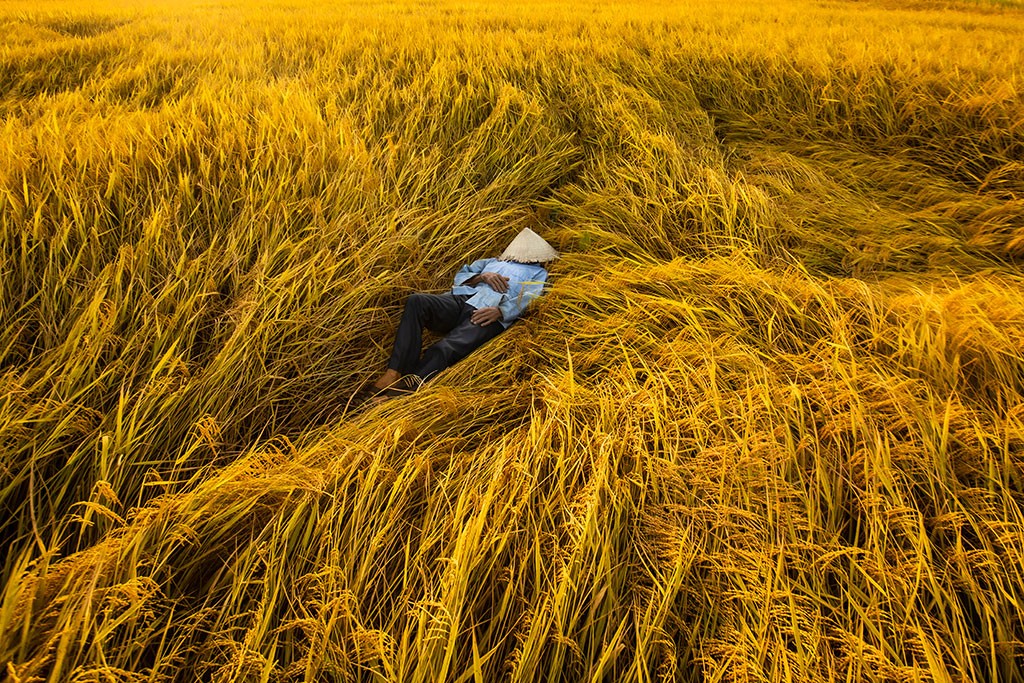
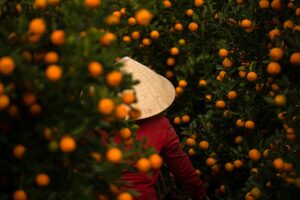
In the Fine Art photo “Resting Gold,” I focused on the contrast between the yellow rice stalks and the blue shirt of the farmer. Each color gives something to the other and creates a harmony that couldn’t be possible without its counterpoint. In my mind, the detailed interest of the stalks is like layers of paint laid down with a palette knife to build texture.
I only photograph with natural light, so color is especially important to me. I can’t control the sun but I can control the times that I head out with my camera. I know that the light of the early morning will create a different effect than the middle of the afternoon. This is why I often shoot very early in the morning when the bright light of dawn is at its strongest.
Yellow is a hue that I return to again and again because of the way that it uplifts the viewer. In a positive context, yellow can have many different meanings depending on its tone and use. It’s invigorating and warm; communicative and creative. It’s optimistic without being too sweet. Yet, there’s still moodiness in its deeper tones.
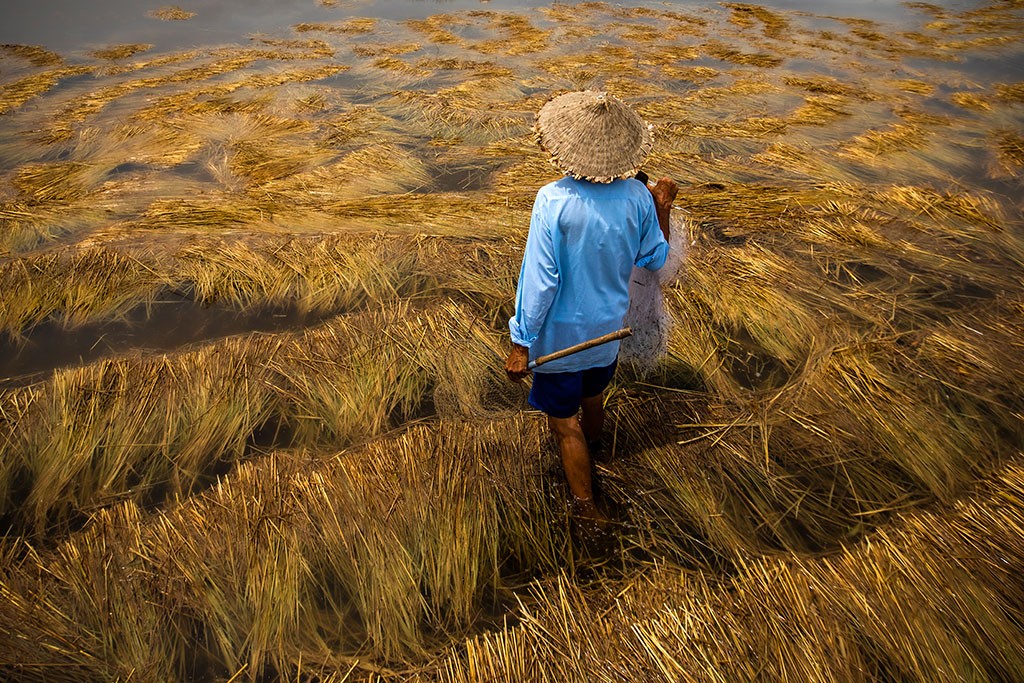
I took this photo during the rainy season in Hoi An. The ricefields were flooded after a particularly intense storm. This Vietnamese heritage fisherman was headed out to catch fish who’d been washed into the fields as the water levels rose.
I was attracted to the bright light that caught the floating rice stalks and the contrast of the shadowed water below.
The World in Color
In color theory, yellow, along with red and blue, are the only colors that can’t be created through the combination of other colors. These three hues are literally color in its purest form. René Descartes, the French mathematician, physician and philosopher, believed that color was more than something visual. It also had the ability to heighten emotion and create a sensation.
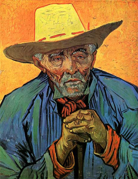
In this portrait, Van Gogh mainly used primary colors, yet, the differences in tones create depth, detail, and balance. This is part of what I attempt to do with my Fine Art photos. Wherever I can, I choose colors that create their own light, depth, and contrast.
One signature in my work is that I prefer to have a powerful primary tone that fills the majority of the photograph. Other colors are used to create harmony and balance. Regardless of whether I’m working with yellow, blue, red or any mix of the three, I try to “pay homage” to one main color while balancing it with another.
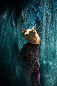
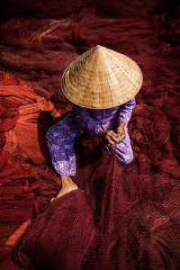
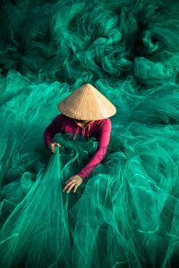
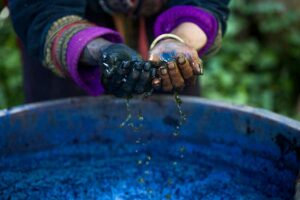
For example, this series of photos of Vietnamese artisans mending fishing nets plays with the balance of the color spectrum, as well as shadow, light and shape.
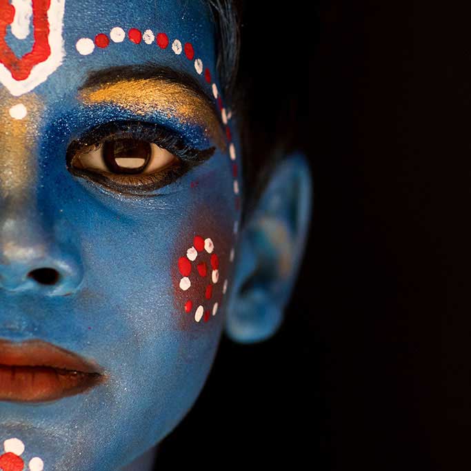
“Krishna III” is another photograph that uses this primary tone rule. The main bright blue of the boy’s face is accentuated with scarlet red and a bit of copper. Each color adds to the final effect.
Each place that I visit for my photographic journeys has its own special hues. When I think about the ethnic groups in Northern Vietnam, I think of indigo so deep it could be a night without stars. Cuba has its iconic red flowers and India is bursting with the sacred color of the orange robes of Hindu sadhus. This diversity is part of what I love about being an artist. Each color gives motion and meaning to the destination.
However, Hoi An and its myriad of yellows will always draw me back. I will always find something new to light my interest like a spark of golden light.
A few links to learn more about the artists featured in this article:
The Birth of Impressionism
Van Gogh and Yellow
Turner’s Yellow
Camille Pissarro and Impressionism: